These aren't necessarily the best photos I've ever taken (and nor are the Womad ones I suspect) but I am so enjoying learning more, understanding more about what I'm doing, and having more choices to make for each shot.
We were given a number of exercises to do, to demonstrate the course content. It wasn't an exam though - phew! For the final class everyone brought in their printed photos from these exercises and we discussed how they worked and what we could have done differently. It was the most interesting and satisfying class.
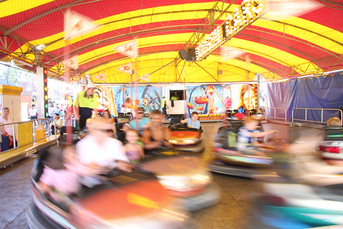
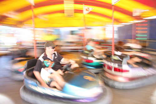
These two pictures of the dodgems both show motion blur. The one above is the proper exercise - the moving objects should be blurry and the background sharp. We also had to do fast motion where all detail is captured - this one I posted earlier was an imperfect example - one of the cars is blurry, but all of them were moving fast so it's a partial win!
For the one below, I tried moving the camera with the subject - you can see that the guy in front is, while still blurry, much less so than the rest of the picture (including the background this time).
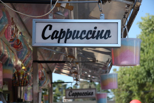
This one uses a short depth of field. I was also thinking about some of the elements (size, colour, line, tone, direction, shape, texture) and rules (rule of thirds, negative space) of design. Of course rules are made to be broken, but it does help to learn about them first. I love the texture/surface of the stainless steel. There are also repeated shapes - the rectangular sign and the pots of fairy floss - leading the eye into the background.
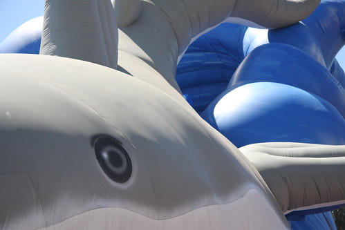
For these closeups of the inflatable shark I was also looking at the rule of thirds - placing the eye at the intersection of thirds. (The rule of thirds can also mean dividing the image into horizontal or vertical bands - like the red and yellow stripes in the picture at the top of this post.)
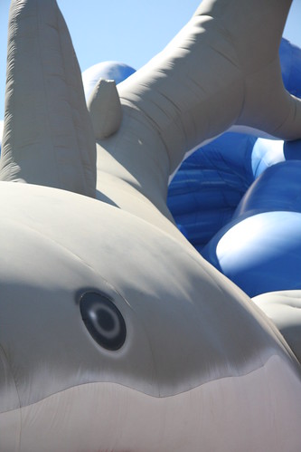
In the chaotic environment of the show, these not-quite abstract closeups were kind of refreshing, especially after running around trying to tick a lot of boxes on the worksheet. One of the exercises was a landscape, which I found really challenging. There just seemed to be far too much going on in each shot. I managed to get something to print and show in class, but it really was a mediocre photo.
4 comments:
I think it's wonderful what you've learned and understand totally about learning first and then breaking the rules. You've written really well about your experiences, in a way that would encourage anyone with an interest to go ahead. looking forward to seeing more. ily ma
love the cappacino shot! - would love to do a photography course - I have no idea what I am doing when I try to photograph my work would be great to learn all these things. looking forward to seeing the Womadelaide images.
Glad the photography class has been worthwhile. I'm enjoying the results of your experimentation :)
fantastic photos, love the dodgems in particular! work is eating me alive here too. whats with that?!
Post a Comment