I only recently came across the idea of jar dyeing, over on Refashionista. Of course I knew about tie-dyeing, and this is similar, a type of low-water immersion dyeing. And you can choose whether to include some tying/rubberbanding or just scrunch or fold the fabric - see also shibori dyeing - into an enclosed space like a glass jar.
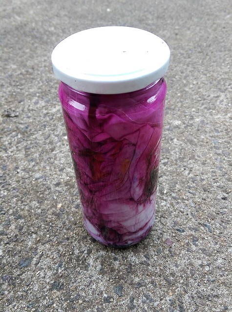
What I liked was the idea that instead of mixing up a dye bath, you could sprinkle the powered dye - and more than one colour - directly into the folds of the fabric as you fold/squash/twist it into the jar, then slowly add hot water, and the whole mess ends up neatly contained. Well, maybe not perfectly neatly: while handling powdered dye so often I did end up with a couple of contamination incidents in the laundry!
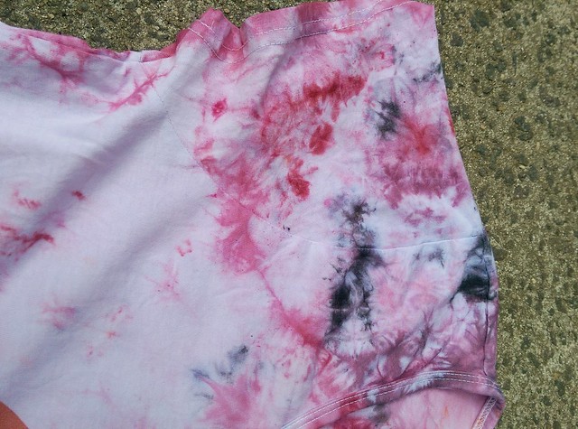
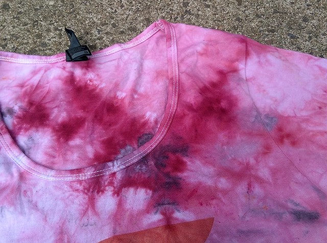
My first try was impulsive. I had this t-shirt that I never wore, because I don't really like white tops. From my limited dye stash, mainly packets I had picked up at half price when Lincraft was closing down in the city last year, I chose 'wine' and 'grey'. I thought these might play ok with the orange print on the t-shirt. It seems obvious with hindsight but I got a shock when I saw the water in the jar turn so pink! The end result was quite pink'n'purple. Not my favourite colour combination and not great with the orange either. The t-shirt was a bit of a mess but I really liked some of the patterns. Later on I overdyed the whole thing with orange, with the background ending up kind of peachy, and I think it is more coherent now - sorry, no final photo though.
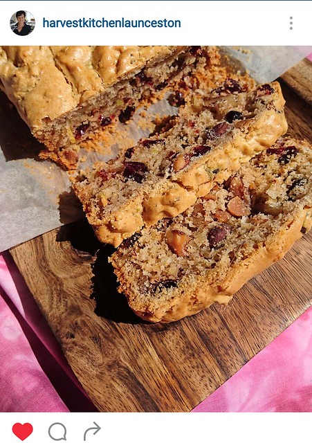
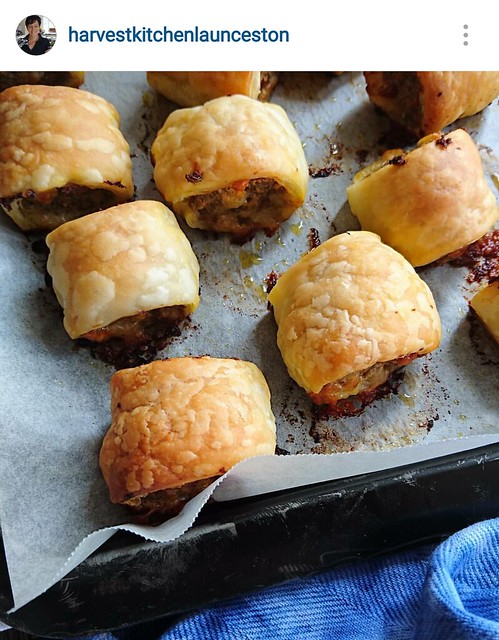
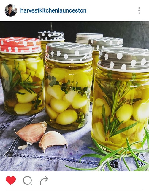
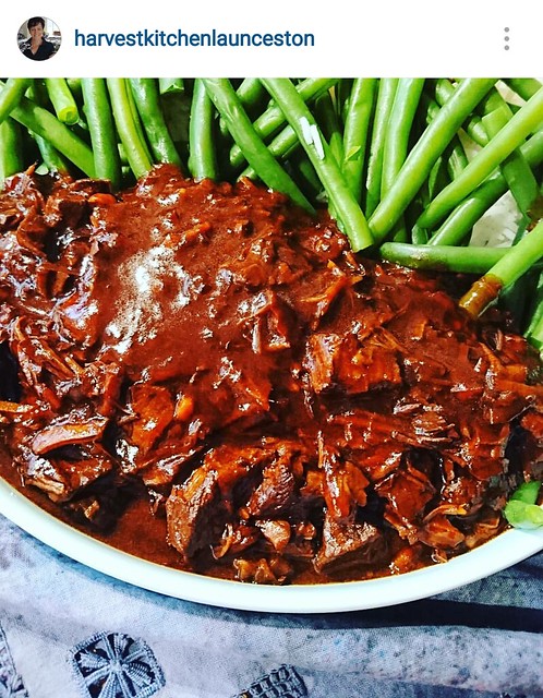
Soon after I shared a few pics of the t-shirt on Instagram, my aunt got in touch. She was planning the food photography for her next recipe book, and wondered if I would dye a piece she could use as a background. Though I protested that I didn't know what I was doing, she really liked the idea of having that family connection in her book (she was also using a tea towel embroidered by my sister) and I agreed to have a go, because I do love a bit of a collaboration.
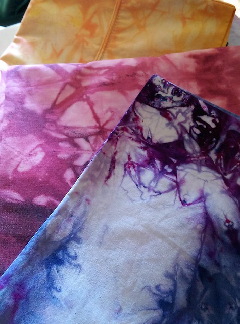
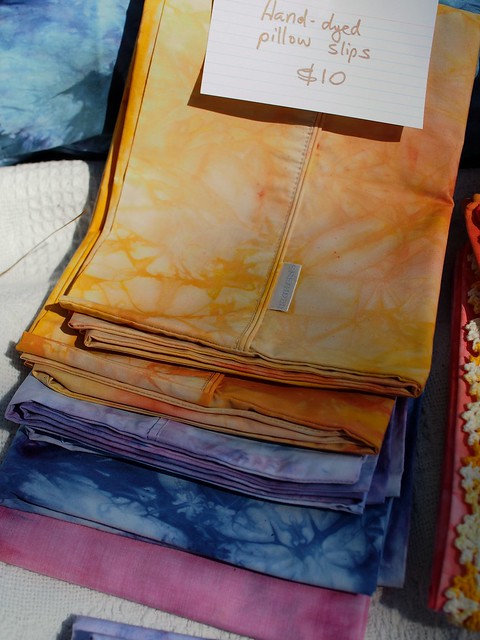
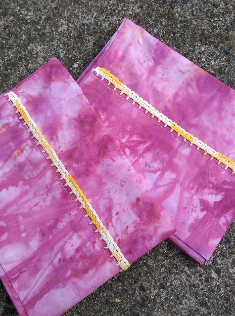
I combed the local op shops looking for tablecloths or other suitable textiles to dye, and I found a lot of white and light coloured cotton pillow slips to practice on. I though some might sell on my Suitcase Rummage stall, or else all my family could all receive them for Christmas. Some of them turned out pretty nice. I think the purple and blue one above was my favourite (and it was one of the ones that sold). I tried a variety of folding, scrunching and stuffing techniques and different combinations of dye and salt. The texture of the fabric seems to make a difference. for some of them I experimented with some contrasting crochet trims, too.
Meanwhile I had to get on with my aunt's photography props. I had found a linen table cloth with some relatively plain hardanger embroidery. I thought this would take the dye ok, and it had decent-sized areas that weren't embroidered so I thought she could probably avoid showing the embroidered part if she preferred.
She wanted deep blues and purples - I hadn't been thrilled with the purple I had on hand, so I only used a little and mostly relied on the blue dye.
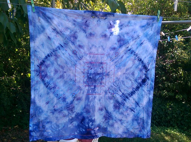
First round - I quite liked this result but quickly decided it was probably too 'busy' overall for a background textile.
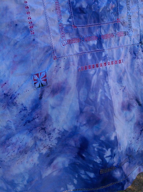
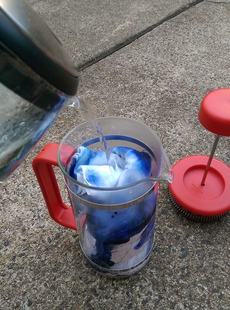
Next I threw it in a grey dye bath to tone it down overall, but that didn't do a lot. I still wasn't happy, so I tried again, laying it out flat, while damp, and sprinkling both powdered black dye and salt all over it. Then I rolled and scrunched it up into my bodum coffee plunger, added the hot water and let it sit like that.
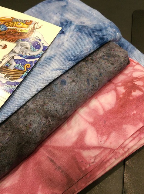
The tablecloth is the grey piece in the middle in the photo above. The final step, while darkening it and toning it down overall, also added tiny speckles of many colours - yellow, green, blue - even though I only used black dye. Of course the dye is designed to be mixed with water and salt before coming into contact with fabrics, and using it that way you would never see the speckles of other colours. I had this happen with some of the other dyes too - not sure if those specks of other colours are meant to be there. I like it though!
As a whole piece, the grey tablecloth was now a pretty strange object, kind of an ugly mess really, but I thought it might still work as a photo background. But to give my aunt more options (and I've said I I don't mind at all if she doesn't end up using any of them in the book), I sent a couple of other options too - one of the pillow slips, the wine-coloured piece in the picture above, and I also dyed a couple of cotton placemats with blue. These were so thin that they could be folded up to look like a serviette as well.
1 comment:
Two of my clever family in the one post!
Post a Comment